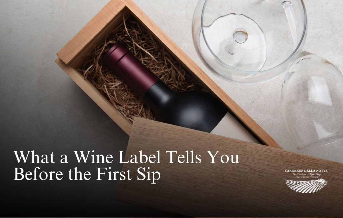
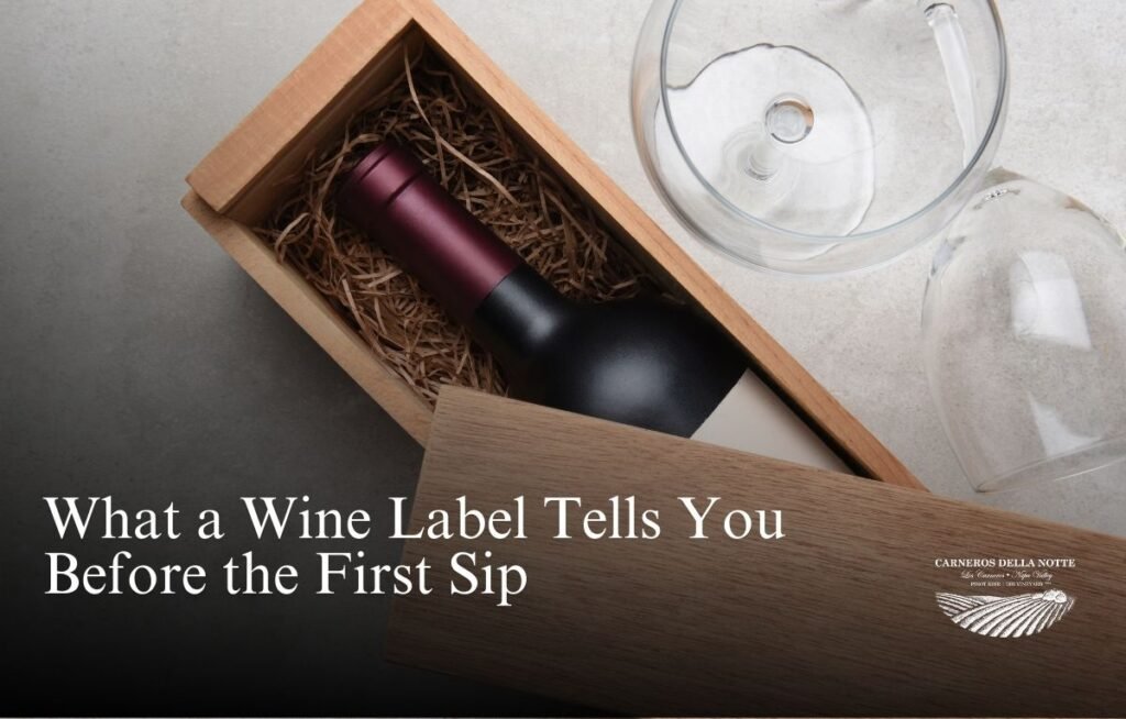
Before the cork is even pulled, your decision is often made. A wine label draws you in, sparks curiosity, and shapes expectations. In Napa, where thousands of bottles line tasting room walls and shelves, label design becomes more than decoration, it becomes a first handshake.
From clean, minimalist layouts to bold, art-inspired visuals, a wine label can influence perception long before the first pour. It might suggest elegance, playfulness, heritage, or innovation. In a region built on both legacy and experimentation, the label is your first introduction.
The Psychology Behind a Wine Label
Wine is as much about experience as it is about taste. The label plays into that experience with cues about the wine’s origin, style, and identity.
Consumers often interpret visual elements—fonts, color, texture, imagery—as signposts for what’s inside. A classic serif font may suggest tradition. A handwritten script might imply artisanal production. Black-and-gold foil can hint at richness or exclusivity.
But beyond aesthetics, wine labels serve as storytellers. They provide an emotional link to the winemaker, the vineyard, or even a season.
Napa producers, especially boutique operations, use labels as a window into their philosophy. A well-designed label can make a wine memorable, and more likely to be chosen again.
What a Wine Label Must Include
All wine sold in the U.S. must follow federal guidelines for label content. These elements are designed to inform the buyer and ensure transparency. Key required items include:
- Brand name – Often the winery or vineyard name.
- Varietal – The type of grape used, such as Pinot Noir or Cabernet Sauvignon.
- Vintage – The year the grapes were harvested.
- Appellation – Where the grapes were grown, such as Napa Valley.
- Alcohol content – Stated as a percentage.
- Government warning – Required health notice.
- Producer and bottler information – Who made and bottled the wine.
While every wine label contains this baseline of information, how it’s presented can vary widely and reflects branding choices.
Label Design: The Art of Suggestion
Good wine label design walks a fine line. It must be distinctive enough to stand out yet clear enough to be read at a glance.
Many Napa wineries work with artists or branding agencies to craft labels that embody their house style. Some opt for clean white space and restrained fonts. Others commission full illustrations that evoke place or mood.
The way a label is framed, where the eye is drawn, and what imagery is used all hint at how the wine wants to be understood.
Some wines practically shout from the shelf, while others invite quiet intrigue. And in a competitive market, that initial attraction can be the difference between being chosen or overlooked.
Trends in Wine Label Design
Wine label trends evolve, just like fashion or architecture. Currently, the market is seeing:
- A shift toward minimalist layouts with hand-drawn typography
- The use of eco-friendly papers and sustainable printing
- QR codes that connect consumers to virtual tastings or vineyard stories
- Glow-in-the-dark or interactive elements for novelty and shelf appeal
These trends reflect consumer demand for authenticity, innovation, and connectivity. For many buyers, a wine label that feels modern, local, or purposeful adds to the appeal of the bottle.
How Wine Labels Influence Taste Expectations
You don’t have to taste a wine to have an opinion about it. Label color and style can prime expectations.
Studies have shown that people often perceive wines differently based on what they read or see before tasting. A label that implies luxury might lead to assumptions about smoothness or richness. One that looks rustic or hand-crafted might prepare the drinker for something earthy and raw.
In Napa, this matters. Wineries are not just selling a beverage, they’re curating a sensory impression. The wine label, as the opening visual note, sets the tone. It’s why branding consistency across vintages is so important, and why even the shape and material of the label are carefully chosen.
Reading Beyond the Visuals
The technical data on a label can reveal as much as the imagery. A Napa Valley AVA designation tells you the grapes come from one of the most renowned winegrowing regions in the world. A lower ABV (alcohol by volume) might suggest a lighter style, while single-vineyard designations indicate a more focused expression.
Here’s what to look for when decoding:
- Estate Bottled – Indicates full control over the grape growing and winemaking process.
- Reserve – While not strictly regulated in the U.S., it often implies a special lot or longer aging.
- Unfiltered – Signals a natural winemaking style, often with texture and complexity.
- Barrel Aged – Suggests oak influence, contributing structure or flavor layers.
- Organic or Sustainable Certifications – Shows environmental commitment.
All of these elements inform the consumer before the wine is even opened.
A Napa Label That Glows
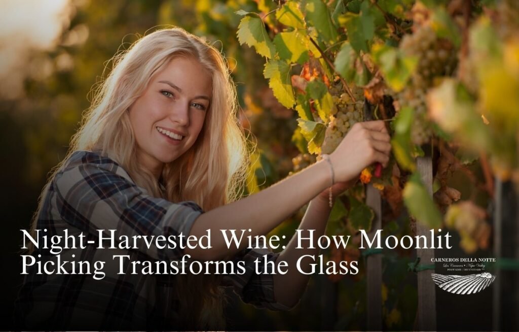
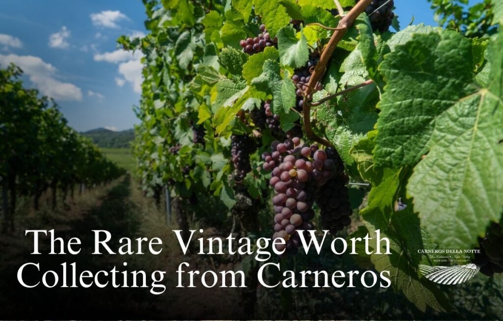
Among Napa’s many standout wine label designs, one quietly captures attention after sunset. Carneros della Notte offers a bottle that glows in the dark—a label detail that speaks directly to its signature technique: harvesting grapes at night.
Carneros della Notte uses its wine label as a storytelling device. The glow pays homage to nighttime precision, but also signals to the drinker that what’s inside was crafted with the same care and clarity. From vineyard to packaging, the label reflects the winery’s identity.
In a region where both legacy and innovation compete for shelf space, a wine label that communicates both story and standard stands out.
For those who collect bottles based on meaning, aesthetic, or method, this kind of thoughtful branding reinforces why wine is more than flavor. It’s identity. It’s memory. And sometimes, it’s glowing proof of something done differently.